This article does not have the goal of bringing up the debatable topic of applications versus web mobile versions in usability. Both are surprisingly quite alike with the same typical mistakes and successful tricks.
#1 DO! …adapt and design thoughtfully for all kinds of mobile devices
Cross-platform design of both mobile applications and mobile versions is a really tough question. Which technique to use? Device-centric or application-centric (if both have their disadvantages)? Is responsive web design a cure-all solution? If you ask these questions, you are already on the right track and understand that an ordinary web design will not work. You need to choose activity-oriented context adaption. The best decision might be a heterogeneous platform to assist your best interests.
#1 DON’T! …obsess over the visual design and extravagant layout

Visualization is obliged to serve the function of attraction. Everybody will agree with that. Nonetheless, this is one of the things that should be kept more restrained and even… conventional for the sake of mobile usability. First of all, because this will assist responsive web design the best. Secondly, because of the high speed expectations from the mobile users. Finally, the third: remember, that information is more important than the flashy color.
#2 DO! …readjust the layout (resolution, portions, simplicity)
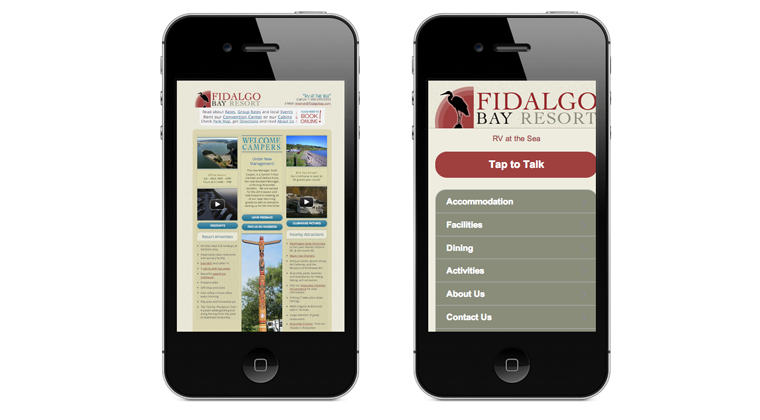
Mobile devices are like computer’s children. They are just the same at first sight, but totally different after the close inspection. If the red dress suits a mother, does not mean it will look perfect on her daughter. Building up the design of the new mobile version or an application first think about the new resolution, then consider the proportions and simplicity. Portions in design make the comprehension distinct and easy.
#2 DON’T! …do bloated sites with flash, heavy graphics, or tons of video
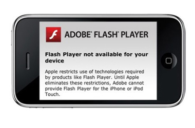
Some do not recommend sophisticated complex web resources even in their full versions. Yet, let us disagree for the full versions. If it serves you client better to see the full picture with numerous details and filling – do include all the necessary materials into the web site. Extensive and impressive web-sites are just delicious for the desktops when you promote a designer or an online store, for instance. But will it work for a mobile version or an app? Surely not. Some features will not even appear on different platforms. The realistic picture that you mostly get is a half-loaded image or an unsupported media plus an upset client who goes elsewhere.
#3 DO! …make it really easy for your customers to find what they want
Clean and not stodgy interface should be supported by the clear guidance of usage. For applications you may even create a short guide or a video tutorial on what you want the user to do with what you present. At times, something that comes as elementary to you is not that effortless for an average user. Some people are not able to find a way to delete the picture from the Gmail not because they are retarded; it is only because it is something new for them.
#3 DON’T! …insert irritating “thrust-down-throat” advertisement

Of course, we do not want you to lose your profit, and yes, probably the windows that pop up have served you well for some period of time on your ordinary web-site. Nevertheless, the “thrust-down-throat” marketing must die. It is not even about the irritation, it is about the long bygone technique, which has been substituted by the more innovative ones. Now you need to buy your client’s time.
#4 DO! …pay attention to the competition
Competition is not only the great motivator; it is also an admirable teacher. Before creating either the mobi1e version or an application go out and see what I already there. Research the existing experience, analyze it and use it, of course. Collect the items that work for you and those ones that you do not like to keep up and further develop of your product.
#4 DON’T! …overlook adapting the mobile content to the needs of the customer
Content is not a puppy, do not be afraid to cut in two. Anyway, do it wisely, to keep to the point and relevant, still giving both general and the main idea. Make yourself think about the situations when your client actually uses the mobile version, for example. Mostly, people prefer intensive reading in other conditions. Leave alone the “ruffles”, the society that prefers mobility appreciates brevity. Never forget about the mini-information architecture (Mini-IA).
#5 DO! …test out

Lots of practical tests show that placing the product untested on the market is a very unprofessional idea. It is like teaching your 5-year old swimming by throwing him/her into the ocean with no explanation. Internet is full of practical testing tips that vary from remote social testing to the traditional paper prototypes. The most valuable, however, is observation, when you personally (or together with your developer) watch a potential customer using the product. All flaws show immediately.
#5 DON’T! …avoid feedback section to save some space (missing the contact info and forms)
We have already mentioned that one needs to be neat with the filling of an application or a mobile version. The only thing you do not want to risk losing is the feedback section with all the necessary contact info and forms. Some think it is not that vital and you may economize space here. No way! Better not create the product at all than have no link with your customer. This will leave you in the darkness unaware of any problems that may emerge.


